Course
Mobile App Design
Mobile App Design
George Mason University
(Professor Eamonn Bourke)
My Role
UX & UI Design
Graphic Design
Motion Design
Creative Brief
Overview
In this 3 week long project in Mobile App Design course at George Mason University, I worked as lead UX researcher and a concept developer during the ideation phase. Upon implementation, I was head of UI, focusing on visual and interaction design.
Problem
Designing for The problem with reading maps is that it can be confusing most of the time. Most map apps have directions that would tell you which way to turn but not a direct visual aid that would point you in the right direction.
Objective
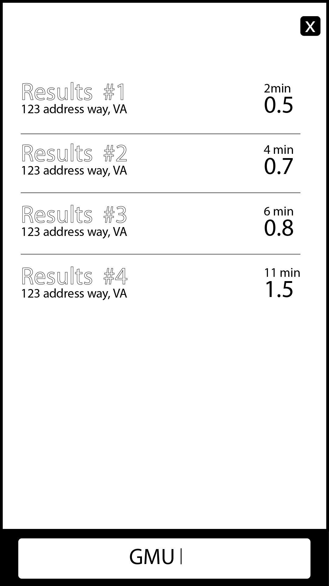
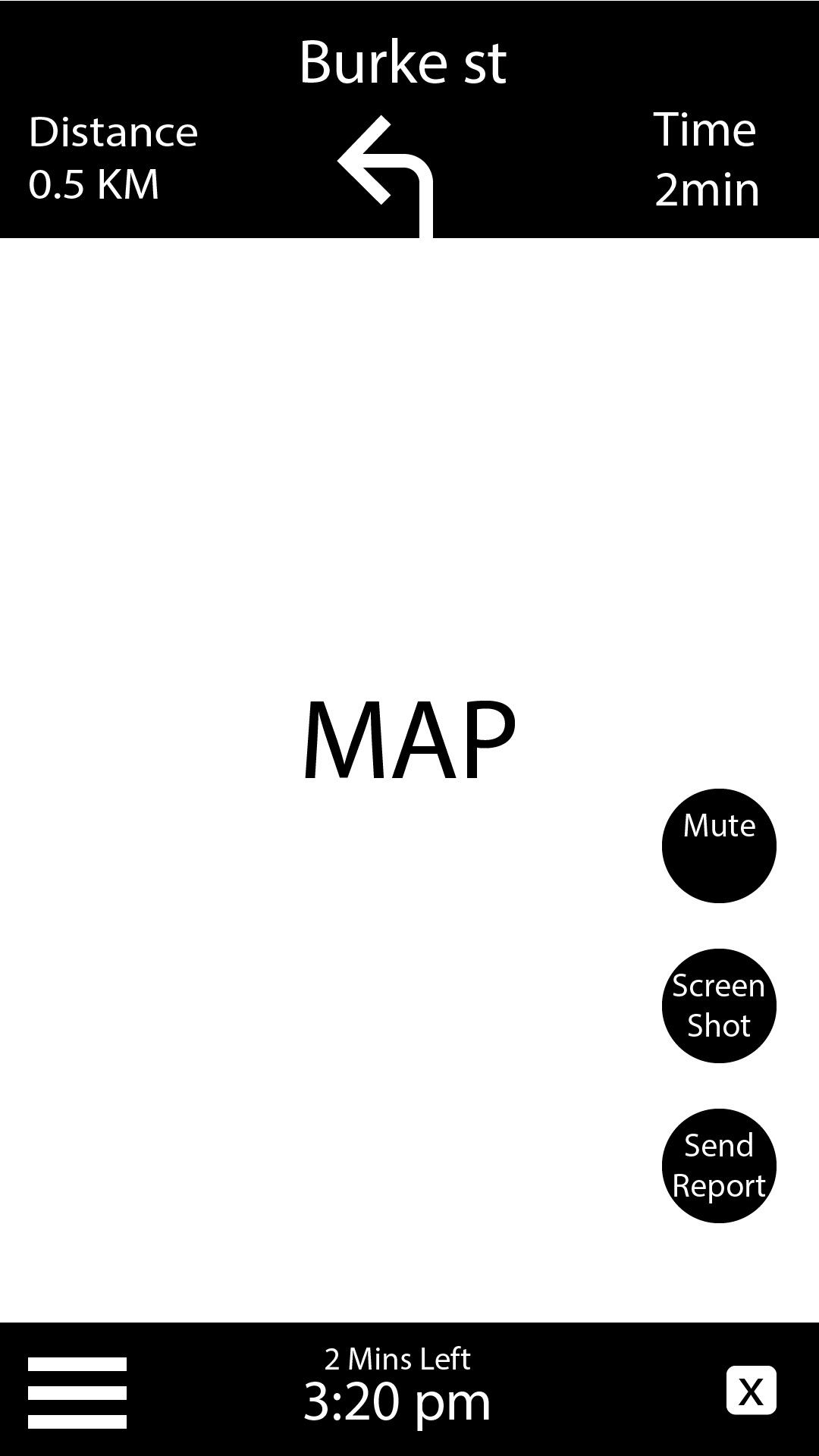
The mobile app that I propose would solve this confusion. It would use a augmented reality interface that has a path line that the use would follow. Not only would the user be able to follow the line it would also indicate on screen where exactly the user is standing with real time camera video. The app would allow users to also screenshot and save the current position and what they see in their surroundings, making it easier to share the user’s location.
Target Audience
The target audience would be of all ages. It is a map app that is designed for people who have trouble reading right and left signals and want a more interactive and precise way to navigate. It would be a useful app for young kids who are lost and need more of a visual aid in navigation, and would also benefit emergency personals when searching for a injured person in the streets.
Measure of Success
This application would be successful if the usability of the device is clear and easy to understand. It should be simple map interface with a line as a guide to pinpoint where the destination is. It would also be a successful app when marketing towards the EMTs or for general population of people who get lost easily.
Goals
The goal of this app is to make navigating easier and more precise with real world pictures instead of an illustrated map. To also help individuals that have a hard time reading maps.
Challenges
One of the challenges that this app will face is the simplicity of the design. It has to be simple enough for a child to comprehend but enough information for users to understand what direction they are going in and where they are located. Another challenge is the usability of glasses as a device being paired with the phone.
Competitors
The Google Maps AR is a big competitor in the augmented reality map field. It uses augmented reality through the phone camera, it shows half the screen with google maps and a arrows that point into the direction of where the users want to go, along with real time visuals. They also added in a companion idea where the companion (like a fox) would show you which direction to go.
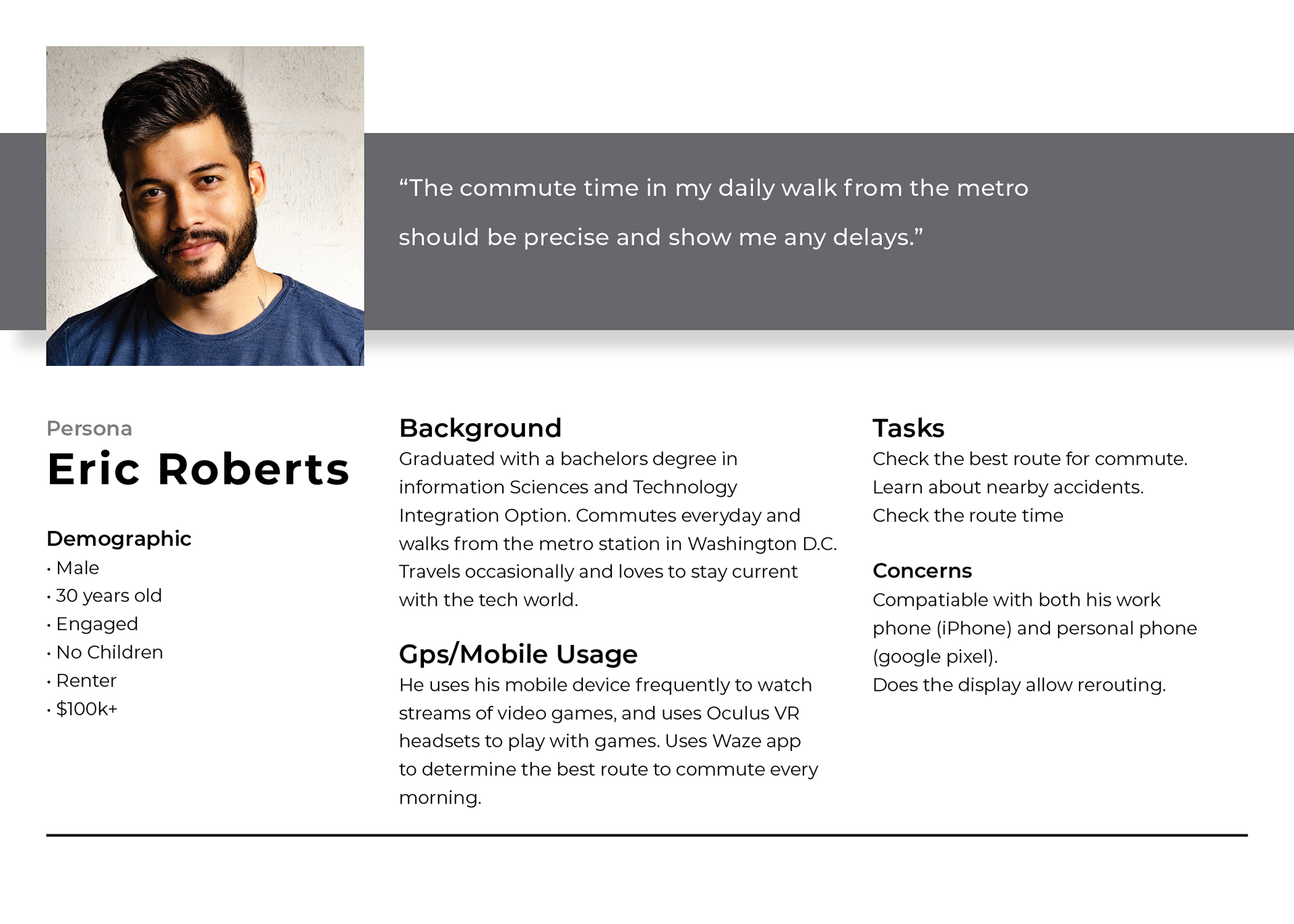
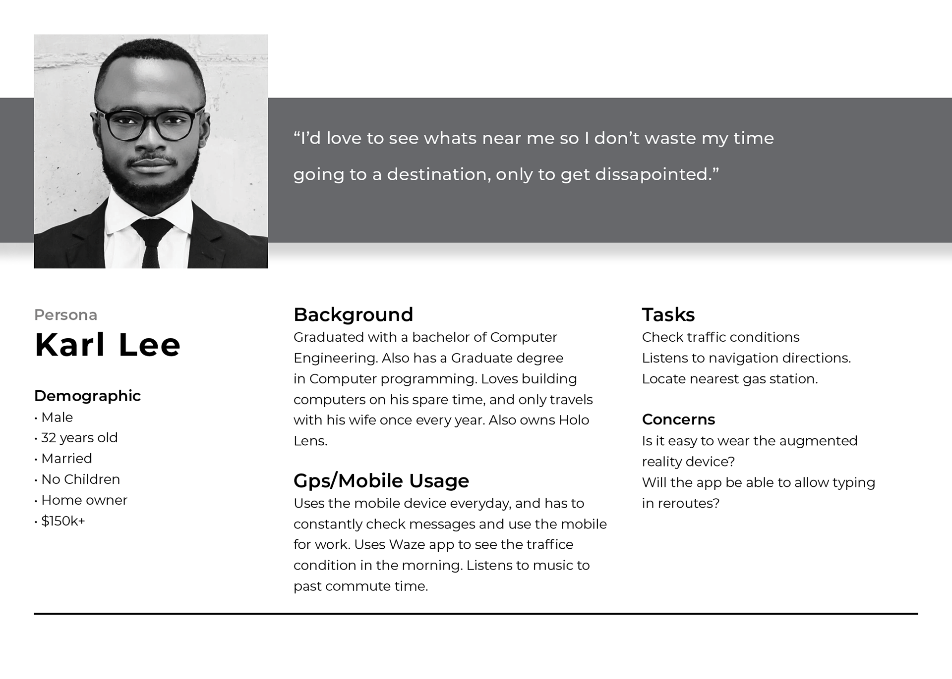
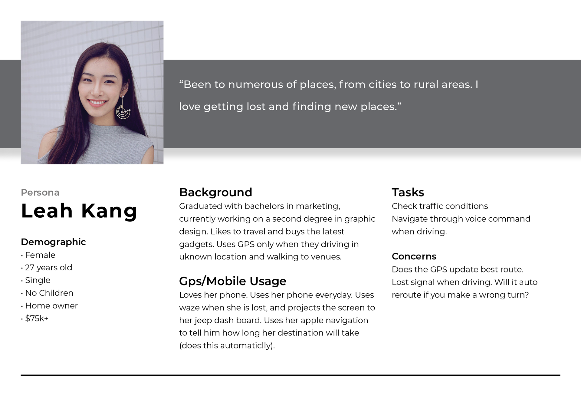
Personas
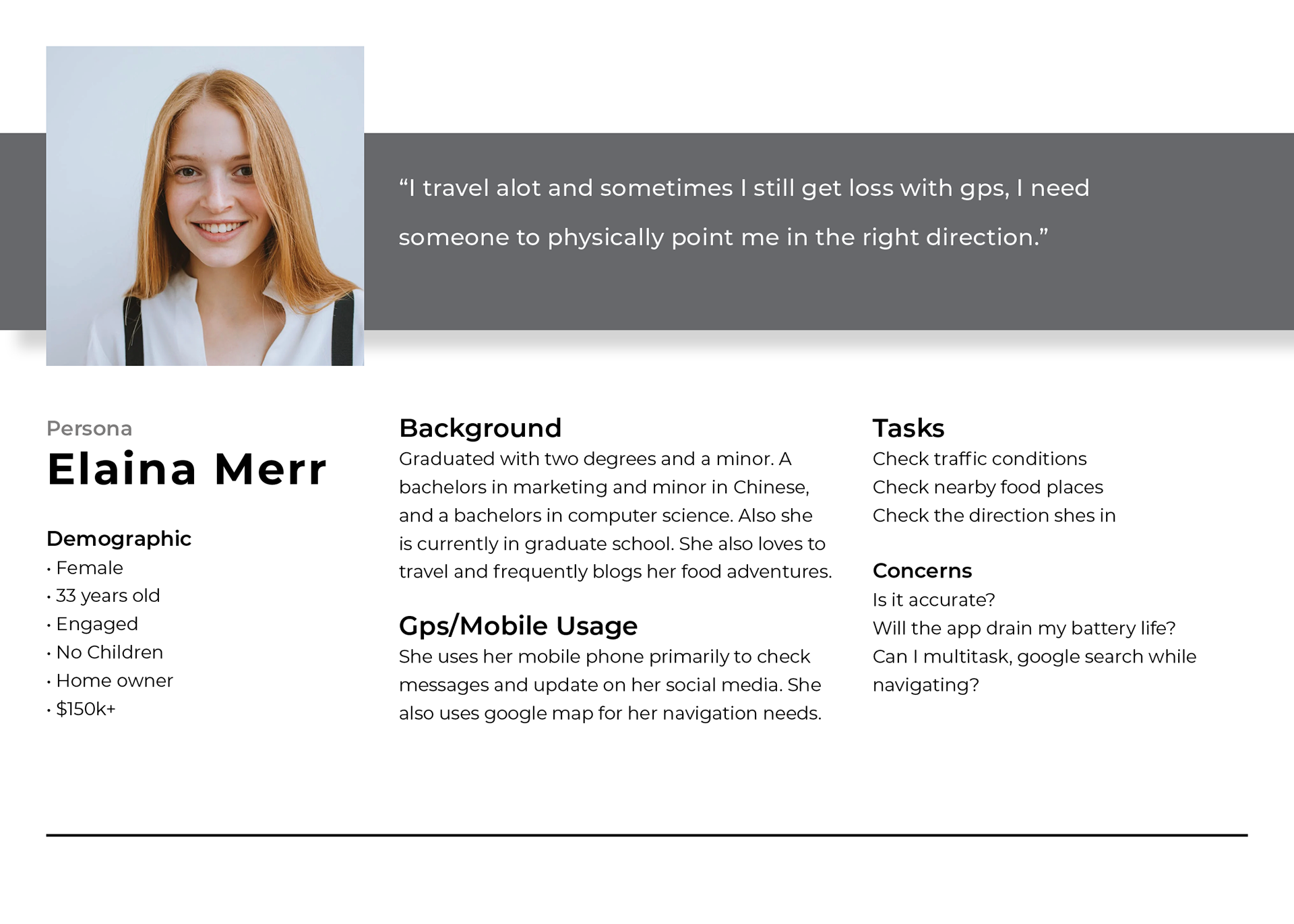
Who would use this app?

User Flows
Wireframes & Visualization


